Name & visual identity |
|
name |
|
 |
Bernstein, like the orchestra director?! No, our consortium is not related to the famous orchestra director and classical music composer Leonard Bernstein. Rather, we share the same name, which in the German language (the language of the project's coordinators) means 'amber'. |
Amber is famous for the insects from far times ago which it traps. We can see it by raising the resin between our eyes and a source of light, a movement identical to that of the historian who looks for traces of the past revealed to him in the structural features of papers. Amber has also been known since the Antiquity as the "electric stone", having the propriety to be electrically charged when rubbed - a wink to our development of digital tools for the study of paper. Hence the name of the consortium and the metaphorical title of the project. |
|
logo |
|
|
The Consortium's logo represents the wooden frame of a traditional paper mould, as well as the shape of a window - a window into the paper and back to the past. |
|
The project's banner presents images typical of its four constituent elements: databases of paper structure reproductions, tools for paper features measurements, contextual resources and an integrated workspace. 2rd from left is a XIXth century Russian blue paper exported to Persia and used for an official document at the Qajar court. The paper is imagined by backlight, hence the still visible writing along the watermark, the horizontal laid lines and two vertical chain lines. 3nd from left we see part of a Fourier transform of the precedent image, with a strong peak corresponding to the frequency of the laid lines. The 1st image shows a text from a medieval manuscript, that provides a context in which papers of particular types and manufacturers were used. The 4th image is that of an Intel Pentium integrated circuits microchip. |
|
color scheme |
|
 |
Our website is dominated by white - the natural color of most papers and for us the symbol of clarity and objectiveness in the scientific work on paper brought by our products. Text is displayed in black, the same as adopted since the early days of printing for typographic work - the sign of solidness and quality. Titling is red, the second most used color in most calligraphic traditions and a symbol of life and innovative spirit. Hyperlinks are naturally blue like the water in wells leading to other realms. |
font choices |
|
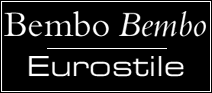 |
Being a multinational consortium with participants from several European countries, and enjoying EU co-funding, it is only natural to have adopted the 'Eurostile' font for the headings in our printed documents. The body of the text is in 'Bembo', which refers to the punch cutter of the famous Renaissance printer Aldus Manutius from Venice. |
specificationstextual identityConsortium name: The Bernstein Consortium graphical identityConsortium logo: Rectangle divided in four (35x25px, 5px border, 75% gray) |